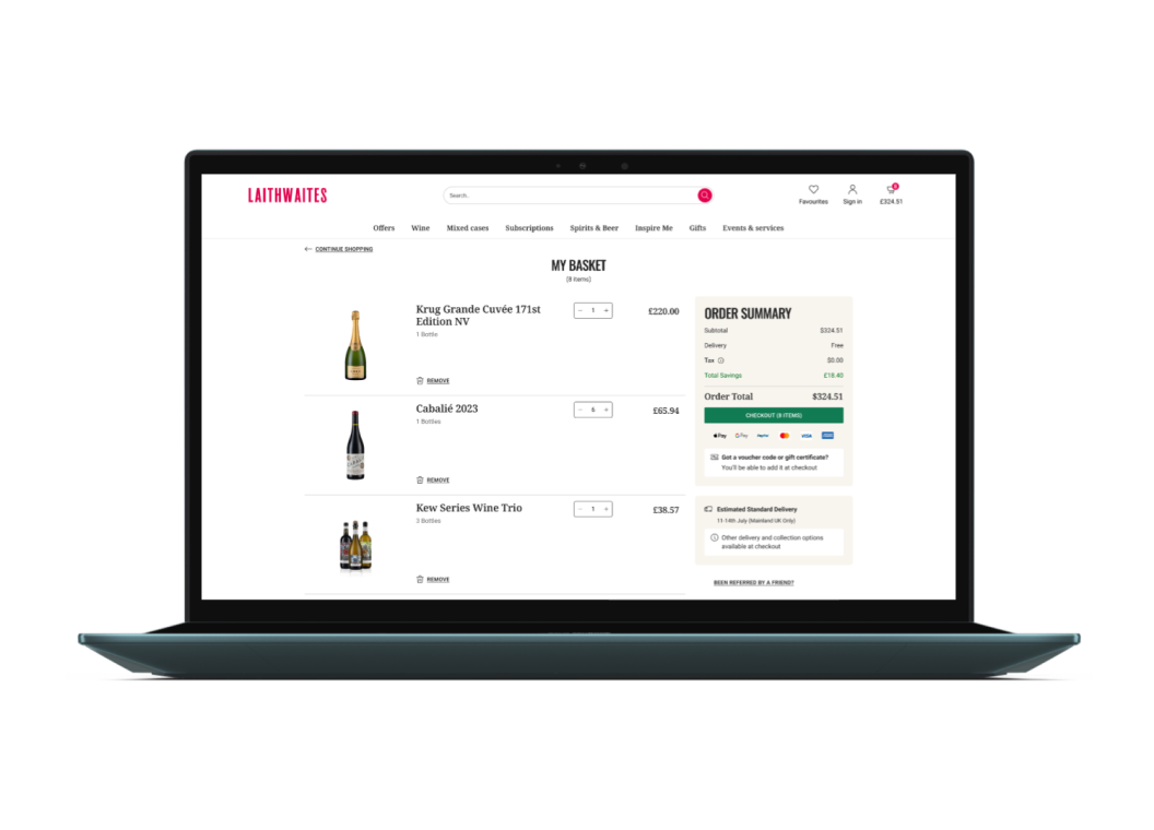
Unified Basket: Seamless Multi‑Brand, Three‑Region Experience


Wine
E-Commerce
Basket
Design Systems
Conversion Optimisation
Web
Company
Laithwaites is a leading direct‑to‑consumer wine retailer operating in the UK, US and APAC, with 17 transactional sites and 700 k+ customers.
Team
Head of Digital Product
Product Manager
Digital Product Design Lead
Senior Product Designer (Me)
UX Designer
Skills / My role
I led UX research and managed visual direction, design system components, and responsive UI across various breakpoints, utilizing tools Figma.
Challenge / Opportunity
Unify 17 brand‑specific baskets into a single adaptive cart that boosts conversion across three regions and integrates with a new headless stack.
Results
Units per order
+0.9pp
Add to bag conversions
+7.3 pp
Results measured over a 4 weeks post launch.
Challenge
Our basket had become a patchwork of brand‑ and region‑specific templates—each behaving differently and difficult to maintain. Mobile users battled hidden subtotals, while desktop shoppers waded through promo clutter. Every campaign tweak required fragile code hacks that slowed delivery.
Leadership asked the product‑design team (with me leading UI) to create one basket pattern that could flex to 17 brands and three regions, handle mixed‑stock fulfilment, and slot neatly into a new headless CommerceTools stack—all while proving a conversion upside.
“How might we create a single basket that’s clear, consistent and conversion‑focused across three regions and multiple brands?”
Process
- Overview
- Discovery
- Laying Foundations
- Managing deep complexity
- Shipping with confidence
Discovery
Fragmentation of the Laithwaites basket experience across 3 regions. (From the left UK, US, APAC)
Our 17 sites surfaced inconsistent basket layouts, blocking the new global product team’s push for a single, region‑agnostic experience—so I partnered with our UX designer, product manager and lead designer to align the vision and translate it into a cohesive UI solution.
Discovery
One example of a low fidelity wireframe used to show improved out of stock behaviour.
With our UX researcher and lead designer, the team set out to diagnose friction and quantify opportunity—applying Baymard best‑practice guidelines, analysing 63 k FullStory sessions and interviewing stakeholders. They identified fragmented UI, unclear pricing hierarchy, high mobile drop‑off and accessibility gaps. The UX designer then handed over low‑fidelity wireframes reflecting her hypotheses on how to solve these issues. I joined the project at this stage to collaborate with the product manager and begin translating these into final UI.
Laying foundations
Early concepts working inwardly from layout to content
Our product manager used the wireframes to draft requirements that blended stakeholder needs and technical constraints from the new headless stack. We then worked through these step by step—I collaborated closely with her to translate each into scalable, component‑driven UI ready for engineering.
Managing deep complexity
A sample of the range of product types and pricing options for our US market sign off.
Designing the UI wasn’t just about layouts—it meant creating visual solutions for complex pricing tiers, case-size logic, multi‑buy promotions and mixed-stock messaging. I designed product components that clearly represented every offer variation. Each one had to be signed off by stakeholders across three markets to ensure compliance and accuracy—a meticulous, high‑stakes phase.
Shipping with confidence
A selection fo the basket in multiple region and brand skews.
We shipped a highly complex, multi‑brand component UI system—built using Figma variants—that handled all regional pricing permutations. I stayed on through developer handoff, fielding implementation questions and ensuring design accuracy during build. This approach later inspired our Vine design system’s mode-switching strategy using variables
Results
Units per order
+0.9pp
Add to bag conversions
+7.3 pp
Customers built larger, higher‑intent baskets: average units per order rose by 0.9, and when shoppers did add items their likelihood to complete checkout jumped 7.3 percentage points—despite a 3.9 point drop in raw add‑to‑bag rate. Conversio, an external analytics partner, measured the results over a four‑week post‑launch window. The streamlined cart is trading volume for quality, signalling clearer intent and healthier revenue per visit.
Browse the work
Kind words from clients & co-workers
“Jim is an absolute powerhouse and a quiet leader. He brings sharp, structured thinking to every challenge, asks the right questions—often before anyone else—and tackles problems calmly and proactively. More than just a designer, he’s a strategic partner, a mentor, and the driving force behind our design system. He goes above and beyond his role, solving complex issues across design, tech, and business. Since joining, he’s completely transformed the way we work.”
Alexandra Constantin
Digital Product Design Lead, Laithwaites
Unified Basket: Seamless Multi‑Brand, Three‑Region Experience


Wine
E-Commerce
Basket
Design Systems
Conversion Optimisation
Web
Company
Laithwaites is a leading direct‑to‑consumer wine retailer operating in the UK, US and APAC, with 17 transactional sites and 700 k+ customers.
Team
Head of Digital Product
Product Manager
Digital Product Design Lead
Senior Product Designer (Me)
UX Designer
Skills / My role
I led UX research and managed visual direction, design system components, and responsive UI across various breakpoints, utilizing tools Figma.
Challenge / Opportunity
Unify 17 brand‑specific baskets into a single adaptive cart that boosts conversion across three regions and integrates with a new headless stack.
Results
Units per order
+0.9pp
Add to bag conversions
+7.3 pp
Results measured over a 4 weeks post launch.
Challenge
Our basket had become a patchwork of brand‑ and region‑specific templates—each behaving differently and difficult to maintain. Mobile users battled hidden subtotals, while desktop shoppers waded through promo clutter. Every campaign tweak required fragile code hacks that slowed delivery.
Leadership asked the product‑design team (with me leading UI) to create one basket pattern that could flex to 17 brands and three regions, handle mixed‑stock fulfilment, and slot neatly into a new headless CommerceTools stack—all while proving a conversion upside.
“How might we create a single basket that’s clear, consistent and conversion‑focused across three regions and multiple brands?”
Process
- Overview
- Discovery
- Laying Foundations
- Managing deep complexity
- Shipping with confidence
Discovery
Our 17 sites surfaced inconsistent basket layouts, blocking the new global product team’s push for a single, region‑agnostic experience—so I partnered with our UX designer, product manager and lead designer to align the vision and translate it into a cohesive UI solution.
Fragmentation of the Laithwaites basket experience across 3 regions. (From the left UK, US, APAC)
Discovery
With our UX researcher and lead designer, the team set out to diagnose friction and quantify opportunity—applying Baymard best‑practice guidelines, analysing 63 k FullStory sessions and interviewing stakeholders. They identified fragmented UI, unclear pricing hierarchy, high mobile drop‑off and accessibility gaps. The UX designer then handed over low‑fidelity wireframes reflecting her hypotheses on how to solve these issues. I joined the project at this stage to collaborate with the product manager and begin translating these into final UI.
One example of a low fidelity wireframe used to show improved out of stock behaviour.
Laying foundations
Our product manager used the wireframes to draft requirements that blended stakeholder needs and technical constraints from the new headless stack. We then worked through these step by step—I collaborated closely with her to translate each into scalable, component‑driven UI ready for engineering.
Early concepts working inwardly from layout to content
Managing deep complexity
Designing the UI wasn’t just about layouts—it meant creating visual solutions for complex pricing tiers, case-size logic, multi‑buy promotions and mixed-stock messaging. I designed product components that clearly represented every offer variation. Each one had to be signed off by stakeholders across three markets to ensure compliance and accuracy—a meticulous, high‑stakes phase.
A sample of the range of product types and pricing options for our US market sign off.
Shipping with confidence
We shipped a highly complex, multi‑brand component UI system—built using Figma variants—that handled all regional pricing permutations. I stayed on through developer handoff, fielding implementation questions and ensuring design accuracy during build. This approach later inspired our Vine design system’s mode-switching strategy using variables
A selection fo the basket in multiple region and brand skews.
Results
Units per order
+0.9pp
Add to bag conversions
+7.3 pp
Customers built larger, higher‑intent baskets: average units per order rose by 0.9, and when shoppers did add items their likelihood to complete checkout jumped 7.3 percentage points—despite a 3.9 point drop in raw add‑to‑bag rate. Conversio, an external analytics partner, measured the results over a four‑week post‑launch window. The streamlined cart is trading volume for quality, signalling clearer intent and healthier revenue per visit.
Browse the work
Kind words from clients & co-workers
“Jim is an absolute powerhouse and a quiet leader. He brings sharp, structured thinking to every challenge, asks the right questions—often before anyone else—and tackles problems calmly and proactively. More than just a designer, he’s a strategic partner, a mentor, and the driving force behind our design system. He goes above and beyond his role, solving complex issues across design, tech, and business. Since joining, he’s completely transformed the way we work.”
Alexandra Constantin
Digital Product Design Lead, Laithwaites
Unified Basket: Seamless Multi‑Brand, Three‑Region Experience


Wine
E-Commerce
Basket
Design Systems
Conversion Optimisation
Web
Company
Laithwaites is a leading direct‑to‑consumer wine retailer operating in the UK, US and APAC, with 17 transactional sites and 700 k+ customers.
Team
Head of Digital Product
Product Manager
Digital Product Design Lead
Senior Product Designer (Me)
UX Designer
Skills / My role
I led UX research and managed visual direction, design system components, and responsive UI across various breakpoints, utilising tools Figma.
Challenge / Opportunity
We faced a major challenge to unify 17 brand‑specific baskets across 3 regions into a single adaptive cart whilst boosting conversion.
Results
Units per order
+0.9pp
Add to bag conversions
+7.3 pp
Results measured over a 4 weeks post launch.
Challenge
Our basket had become a patchwork of brand‑ and region‑specific templates—each behaving differently and difficult to maintain. Mobile users battled hidden subtotals, while desktop shoppers waded through promo clutter. Every campaign tweak required fragile code hacks that slowed delivery.
Leadership asked the product‑design team (with me leading UI) to create one basket pattern that could flex to 17 brands and three regions, handle mixed‑stock fulfilment, and slot neatly into a new headless CommerceTools stack—all while proving a conversion upside.
“How might we create a single basket that’s clear, consistent and conversion‑focused across three regions and multiple brands?”
Process
- Overview
- Discovery
- Laying Foundations
- Managing deep complexity
- Shipping with confidence
Discovery
Our 17 sites surfaced inconsistent basket layouts, blocking the new global product team’s push for a single, region‑agnostic experience—so I partnered with our UX designer, product manager and lead designer to align the vision and translate it into a cohesive UI solution.
Fragmentation of the Laithwaites basket experience across 3 regions. (From the left UK, US, APAC)
Discovery
With our UX researcher and lead designer, the team set out to diagnose friction and quantify opportunity—applying Baymard best‑practice guidelines, analysing 63 k FullStory sessions and interviewing stakeholders. They identified fragmented UI, unclear pricing hierarchy, high mobile drop‑off and accessibility gaps. The UX designer then handed over low‑fidelity wireframes reflecting her hypotheses on how to solve these issues. I joined the project at this stage to collaborate with the product manager and begin translating these into final UI.
One example of a low fidelity wireframe used to show improved out of stock behaviour.
Laying foundations
Our product manager used the wireframes to draft requirements that blended stakeholder needs and technical constraints from the new headless stack. We then worked through these step by step—I collaborated closely with her to translate each into scalable, component‑driven UI ready for engineering.
Early concepts working inwardly from layout to content
Managing deep complexity
Designing the UI wasn’t just about layouts—it meant creating visual solutions for complex pricing tiers, case-size logic, multi‑buy promotions and mixed-stock messaging. I designed product components that clearly represented every offer variation. Each one had to be signed off by stakeholders across three markets to ensure compliance and accuracy—a meticulous, high‑stakes phase.
A sample of the range of product types and pricing options for our US market sign off.
Shipping with confidence
We shipped a highly complex, multi‑brand component UI system—built using Figma variants—that handled all regional pricing permutations. I stayed on through developer handoff, fielding implementation questions and ensuring design accuracy during build. This approach later inspired our Vine design system’s mode-switching strategy using variables
A selection fo the basket in multiple region and brand skews.
Results
Units per order
+0.9pp
Add to bag conversions
+7.3 pp
Customers built larger, higher‑intent baskets: average units per order rose by 0.9, and when shoppers did add items their likelihood to complete checkout jumped 7.3 percentage points—despite a 3.9 point drop in raw add‑to‑bag rate. Conversio, an external analytics partner, measured the results over a four‑week post‑launch window. The streamlined cart is trading volume for quality, signalling clearer intent and healthier revenue per visit.
Browse the work
Kind words from clients & co-workers
Alexandra Constantin
Digital Product Design Lead, Laithwaites
“Jim is an absolute powerhouse and a quiet leader. He brings sharp, structured thinking to every challenge, asks the right questions—often before anyone else—and tackles problems calmly and proactively. More than just a designer, he’s a strategic partner, a mentor, and the driving force behind our design system. He goes above and beyond his role, solving complex issues across design, tech, and business. Since joining, he’s completely transformed the way we work.”