Vine – “The System That Made Our Tiny Design Team Work Like a 10x Org”


Wine
E-Commerce
Design Systems
Product Design
Web
Company
Laithwaites is a leading direct‑to‑consumer wine retailer operating in the UK, US and APAC, with 17 transactional sites and 700 k+ customers.
Team
Digital Product Design Lead
Senior Product Designer (Me)
Product Designer
Associate Support Analyst
Skills / My role
I led the visual direction, developed design system components, and set up a variable schema for seamless theme switching across brands. My role involved research, building the component library, designing user interfaces, and documenting the design system.
Challenge / Opportunity
We faced a major challenge to quickly redesign our e-commerce buying journey pages while preparing for a platform migration. We didn’t just need a better component library—we needed a smarter way to design at scale, fast
Results
Up to
94%
Fewer Variants
127
Components Built
3.6k
Component Inserts
17
Variable Brand Modes
Challenge
We were a new small product design team facing a big challenge: redesigning the entire e-commerce buying journey experience while preparing for a major platform migration.
The deadline was fixed, and the strategy came top-down—we had to make it work.
Our design operations weren’t built for this scale. We were missing critical components, and what we had was a patchwork of short-term fixes—rushed workarounds that got the last job out the door. There had never been time to think systemically, and now we were paying the price.
We didn’t just need a better component library—we needed a smarter way to design at scale, fast.
“How might we reduce duplication, rebuild only what matters, and create a system that lets a small team deliver like a much bigger one—without the burnout??”
Process
- Discovery & Audit
- Semantic Foundation Definition
- Quality Assurance & Visual Regression
- Rollout & Onboarding
- Stakeholder Presentation & Approval
- Adoption
Discovery & Audit
The complexity was mounting. Every new product page had to work across 17 brands, six breakpoints, and multiple regional requirements. As demand grew, our component count exploded, consistency broke down, and burnout loomed. We needed a reset.
Brand variants of basket experience
We began by auditing the UK sites and quickly uncovered years of short-term fixes—redundant designs repeated across screens. Nothing had been built to scale.
A review of our international websites highlighting repetitive elements in the FAQ section.
Digging into our design system, LDX, revealed deeper problems. Brand-specific component variants had ballooned beyond what our small team could manage, especially without a dedicated design systems role.
LDX Design System contained over 1220 buttons.
Our colour system was another weak link. Inherited from an external agency, it had been approved as a brand guideline but was never designed to support a product design system. It lacked semantic structure, a full spectrum of tints and shades, and hadn’t accounted for accessibility—leading to inconsistent styles and diluted brand identities.
A small selection agency colour guidelines we recieved.
Typography was equally fragmented. No shared structure, inconsistent styles, and a type scale built for marketing headlines—making fast decisions unnecessarily hard.
Highlighting mismatched typography styles between brands
When we compared our layouts and breakpoints to leading e-commerce sites, it became clear: our system wasn’t putting the product first. And without a defined aspect ratio for product imagery, inconsistent presentation and awkward layouts were inevitable.
A comparison of Laithwaites UK and The White Company homepages.
We also found that merchandising elements like logos, badges, and decorative accents were added ad hoc, with no centralised source of truth. We didn’t just lack structure—we lacked the assets.
A selection of captured merchandising assets in LDX.
Rebuilding Foundation Definitions
We traced the source of every colour and rebuilt them into per-brand primitive palettes. Inspired by systems like Uber Base, Decathlon Vitamin, and Tailwind CSS, we created a semantic structure for text, icons, borders, and backgrounds. With tokens stored as variables, we enabled scalable theme swapping across all partner brands.

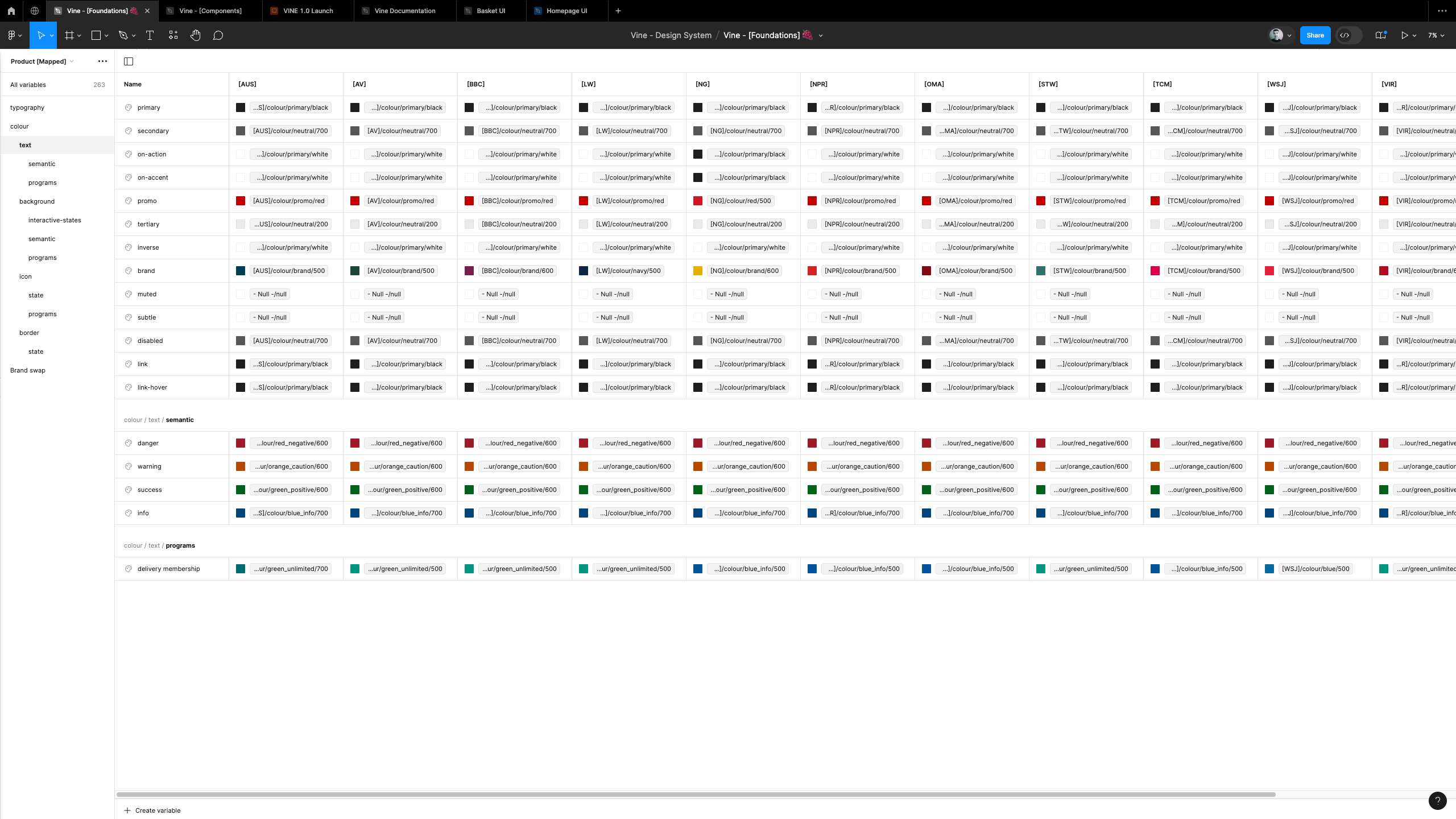
Vine foundations variable structure defined in Figma
We redefined typography. A tighter scale supported dense product content, with fewer semantic roles to reduce decision fatigue. Variables and mode switching handled brand-level customisation.
Vine foundations variable structure defined in Figma
We reduced breakpoints from six to five for long-term simplicity. We introduced fixed image aspect ratios for better layout consistency and fine-tuned margins based on stakeholder feedback. Spacing was redefined using a consistent 4pt scale and implemented via tokens.
Examples on Vine layout foundation including breakpoints, spacing tokens and fixed aspect ratio images.
We also built a centralised asset library—logos, icons, and merchandising elements—by tracking down the source files from all three global regions and our internal digital design team. This gave us a clear, consolidated picture of what was actually in use, allowing us to establish a reliable source of truth.
A selection of logo and icon elements.
Rebuilding Comoponent Library
We rebuilt core components to be responsive, scalable, and brand-flexible. We had used V0 on other projects and noticed that the designs it generated—based on the Shadcn UI library—resonated well with stakeholders. The familiarity of these patterns made them easier to accept and build consensus around, so we used them as the foundation for our component rebuild.
We used this as the foundation for our Figma rebuild—designing with visual structure, interaction states, and properties, all powered by a tokenised system. Mode switching let us use a single library across all brands. Introducing variables cut component variant count dramatically—up to 94% in some cases.
Quality Assurance
We didn’t just build—we tested every layer to prove it worked.
We validated the new system by rebuilding live pages across brands and testing every element. Brand modes were rigorously tested to ensure layout and visual fidelity.
Vine Design System Figma components.
Quality Assurance
We didn’t just build—we tested every layer to prove it worked.
We validated the new system by rebuilding live pages across brands and testing every element. Brand modes were rigorously tested to ensure layout and visual fidelity.
Key pages successfully brand swapping using modes.
Rollout & Onboarding
Theme switching became instant. Junior designers could reskin brands and migrate legacy files quickly. Documentation reduced dependency on meetings, and consistency improved across outputs.
Vine design system documented using Zeroheight.
Adoption
The system proved its value when a complex, multi-brand checkout flow—over 300 views—was designed and delivered by a single designer (me). Work that would have previously required multiple contributors became possible solo—evidence that we hadn’t just scaled components, we’d scaled design capacity. It’s now being adopted across digital and product teams as the foundation for future work.
User flow depicting the basic navigation of the checkout project
Results
Up to
94%
Fewer Variants
127
Components Built
3.6k
Component Inserts
17
Variable Brand Modes
With up to 94% fewer component variants, instant theme switching, and semantic foundations in place, we enabled faster delivery, reduced duplication, and freed up senior designers to focus on high-value work. The system is now being adopted across digital and product teams as the foundation for future design at scale.
Browse the work
Kind words from clients & co-workers
“Jim is an absolute powerhouse and a quiet leader. He brings sharp, structured thinking to every challenge, asks the right questions—often before anyone else—and tackles problems calmly and proactively. More than just a designer, he’s a strategic partner, a mentor, and the driving force behind our design system. He goes above and beyond his role, solving complex issues across design, tech, and business. Since joining, he’s completely transformed the way we work.”
Alexandra Constantin
Digital Product Design Lead, Laithwaites
Vine – “The System That Made Our Tiny Design Team Work Like a 10x Org”


Wine
E-Commerce
Design Systems
Product Design
Web
Company
Laithwaites is a leading direct‑to‑consumer wine retailer operating in the UK, US and APAC, with 17 transactional sites and 700 k+ customers.
Team
Digital Product Design Lead
Senior Product Designer (Me)
Product Designer
Associate Support Analyst
Skills / My role
I led the visual direction, developed design system components, and set up a variable schema for seamless theme switching across brands. My role involved research, building the component library, designing user interfaces, and documenting the design system.
Challenge / Opportunity
We faced a major challenge to quickly redesign our e-commerce buying journey pages while preparing for a platform migration. We didn’t just need a better component library—we needed a smarter way to design at scale, fast
Results
Up to
94%
Fewer Variants
127
Components Built
3.6k
Component Inserts
17
Variable Brand Modes
Challenge
We were a new small product design team facing a big challenge: redesigning the entire e-commerce buying journey experience while preparing for a major platform migration.
The deadline was fixed, and the strategy came top-down—we had to make it work.
Our design operations weren’t built for this scale. We were missing critical components, and what we had was a patchwork of short-term fixes—rushed workarounds that got the last job out the door. There had never been time to think systemically, and now we were paying the price.
We didn’t just need a better component library—we needed a smarter way to design at scale, fast.
“How might we reduce duplication, rebuild only what matters, and create a system that lets a small team deliver like a much bigger one—without the burnout??”
Process
- Discovery & Audit
- Semantic Foundation Definition
- Quality Assurance & Visual Regression
- Rollout & Onboarding
- Stakeholder Presentation & Approval
- Adoption
Discovery & Audit
The complexity was mounting. Every new product page had to work across 17 brands, six breakpoints, and multiple regional requirements. As demand grew, our component count exploded, consistency broke down, and burnout loomed. We needed a reset.
Brand variants of basket experience
We began by auditing the UK sites and quickly uncovered years of short-term fixes—redundant designs repeated across screens. Nothing had been built to scale.
A review of our international websites highlighting repetitive elements in the FAQ section.
Digging into our design system, LDX, revealed deeper problems. Brand-specific component variants had ballooned beyond what our small team could manage, especially without a dedicated design systems role.
LDX Design System contained over 1220 buttons.
Our colour system was another weak link. Inherited from an external agency, it had been approved as a brand guideline but was never designed to support a product design system. It lacked semantic structure, a full spectrum of tints and shades, and hadn’t accounted for accessibility—leading to inconsistent styles and diluted brand identities.
A small selection agency colour guidelines we recieved.
Typography was equally fragmented. No shared structure, inconsistent styles, and a type scale built for marketing headlines—making fast decisions unnecessarily hard.
Highlighting mismatched typography styles between brands
When we compared our layouts and breakpoints to leading e-commerce sites, it became clear: our system wasn’t putting the product first. And without a defined aspect ratio for product imagery, inconsistent presentation and awkward layouts were inevitable.
A comparison of Laithwaites UK and The White Company homepages.
We also found that merchandising elements like logos, badges, and decorative accents were added ad hoc, with no centralised source of truth. We didn’t just lack structure—we lacked the assets.
A selection of captured merchandising assets in LDX.
Rebuilding Foundation Definitions
We traced the source of every colour and rebuilt them into per-brand primitive palettes. Inspired by systems like Uber Base, Decathlon Vitamin, and Tailwind CSS, we created a semantic structure for text, icons, borders, and backgrounds. With tokens stored as variables, we enabled scalable theme swapping across all partner brands.


Vine foundations variable structure defined in Figma
We redefined typography. A tighter scale supported dense product content, with fewer semantic roles to reduce decision fatigue. Variables and mode switching handled brand-level customisation.
Vine foundations variable structure defined in Figma
We reduced breakpoints from six to five for long-term simplicity. We introduced fixed image aspect ratios for better layout consistency and fine-tuned margins based on stakeholder feedback. Spacing was redefined using a consistent 4pt scale and implemented via tokens.
Examples on Vine layout foundation including breakpoints, spacing tokens and fixed aspect ratio images.
We also built a centralised asset library—logos, icons, and merchandising elements—by tracking down the source files from all three global regions and our internal digital design team. This gave us a clear, consolidated picture of what was actually in use, allowing us to establish a reliable source of truth.
A selection of logo and icon elements.
Rebuilding Comoponent Library
We rebuilt core components to be responsive, scalable, and brand-flexible. We had used V0 on other projects and noticed that the designs it generated—based on the Shadcn UI library—resonated well with stakeholders. The familiarity of these patterns made them easier to accept and build consensus around, so we used them as the foundation for our component rebuild.
We used this as the foundation for our Figma rebuild—designing with visual structure, interaction states, and properties, all powered by a tokenised system. Mode switching let us use a single library across all brands. Introducing variables cut component variant count dramatically—up to 94% in some cases.
Quality Assurance
We didn’t just build—we tested every layer to prove it worked.
We validated the new system by rebuilding live pages across brands and testing every element. Brand modes were rigorously tested to ensure layout and visual fidelity.
Vine Design System Figma components.
Quality Assurance
We didn’t just build—we tested every layer to prove it worked.
We validated the new system by rebuilding live pages across brands and testing every element. Brand modes were rigorously tested to ensure layout and visual fidelity.
Key pages successfully brand swapping using modes.
Rollout & Onboarding
Theme switching became instant. Junior designers could reskin brands and migrate legacy files quickly. Documentation reduced dependency on meetings, and consistency improved across outputs.
Vine design system documented using Zeroheight.
Adoption
The system proved its value when a complex, multi-brand checkout flow—over 300 views—was designed and delivered by a single designer (me). Work that would have previously required multiple contributors became possible solo—evidence that we hadn’t just scaled components, we’d scaled design capacity. It’s now being adopted across digital and product teams as the foundation for future work.
User flow depicting the basic navigation of the checkout project
Results
Up to
94%
Fewer Variants
127
Components Built
3.6k
Component Inserts
17
Variable Brand Modes
With up to 94% fewer component variants, instant theme switching, and semantic foundations in place, we enabled faster delivery, reduced duplication, and freed up senior designers to focus on high-value work. The system is now being adopted across digital and product teams as the foundation for future design at scale.
Browse the work
Kind words from clients & co-workers
“Jim is an absolute powerhouse and a quiet leader. He brings sharp, structured thinking to every challenge, asks the right questions—often before anyone else—and tackles problems calmly and proactively. More than just a designer, he’s a strategic partner, a mentor, and the driving force behind our design system. He goes above and beyond his role, solving complex issues across design, tech, and business. Since joining, he’s completely transformed the way we work.”
Alexandra Constantin
Digital Product Design Lead, Laithwaites
Vine – “The System That Made Our Tiny Design Team Work Like a 10x Org”


Wine
E-Commerce
Design Systems
Product Design
Web
Company
Laithwaites is a leading direct‑to‑consumer wine retailer operating in the UK, US and APAC, with 17 transactional sites and 700 k+ customers.
Team
Digital Product Design Lead
Senior Product Designer (Me)
Product Designer
Associate Support Analyst
Skills / My role
I led the visual direction, developed design system components, and set up a variable schema for seamless theme switching across brands. My role involved research, building the component library, designing user interfaces, and documenting the design system.
Challenge / Opportunity
We faced a major challenge to quickly redesign our e-commerce buying journey pages while preparing for a platform migration. We didn’t just need a better component library—we needed a smarter way to design at scale, fast
Results
Up to
94%
Fewer Variants
127
Components Built
3.6k
Component Inserts
17
Variable Brand Modes
Challenge
We were a new small product design team facing a big challenge: redesigning the entire e-commerce buying journey experience while preparing for a major platform migration.
The deadline was fixed, and the strategy came top-down—we had to make it work.
Our design operations weren’t built for this scale. We were missing critical components, and what we had was a patchwork of short-term fixes—rushed workarounds that got the last job out the door. There had never been time to think systemically, and now we were paying the price.
We didn’t just need a better component library—we needed a smarter way to design at scale, fast.
“How might we reduce duplication, rebuild only what matters, and create a system that lets a small team deliver like a much bigger one—without the burnout??”
Process
- Discovery & Audit
- Semantic Foundation Definition
- Quality Assurance & Visual Regression
- Rollout & Onboarding
- Stakeholder Presentation & Approval
- Adoption
Discovery & Audit
The complexity was mounting. Every new product page had to work across 17 brands, six breakpoints, and multiple regional requirements. As demand grew, our component count exploded, consistency broke down, and burnout loomed. We needed a reset.
Brand variants of basket experience
We began by auditing the UK sites and quickly uncovered years of short-term fixes—redundant designs repeated across screens. Nothing had been built to scale.
A review of our international websites highlighting repetitive elements in the FAQ section.
Digging into our design system, LDX, revealed deeper problems. Brand-specific component variants had ballooned beyond what our small team could manage, especially without a dedicated design systems role.
LDX Design System contained over 1220 buttons.
Our colour system was another weak link. Inherited from an external agency, it had been approved as a brand guideline but was never designed to support a product design system. It lacked semantic structure, a full spectrum of tints and shades, and hadn’t accounted for accessibility—leading to inconsistent styles and diluted brand identities.
A small selection agency colour guidelines we recieved.
Typography was equally fragmented. No shared structure, inconsistent styles, and a type scale built for marketing headlines—making fast decisions unnecessarily hard.
Highlighting mismatched typography styles between brands
When we compared our layouts and breakpoints to leading e-commerce sites, it became clear: our system wasn’t putting the product first. And without a defined aspect ratio for product imagery, inconsistent presentation and awkward layouts were inevitable.
A comparison of Laithwaites UK and The White Company homepages.
We also found that merchandising elements like logos, badges, and decorative accents were added ad hoc, with no centralised source of truth. We didn’t just lack structure—we lacked the assets.
A selection of captured merchandising assets in LDX.
Rebuilding Foundation Definitions
We traced the source of every colour and rebuilt them into per-brand primitive palettes. Inspired by systems like Uber Base, Decathlon Vitamin, and Tailwind CSS, we created a semantic structure for text, icons, borders, and backgrounds. With tokens stored as variables, we enabled scalable theme swapping across all partner brands.


Vine foundations variable structure defined in Figma
We redefined typography. A tighter scale supported dense product content, with fewer semantic roles to reduce decision fatigue. Variables and mode switching handled brand-level customisation.
Vine foundations variable structure defined in Figma
We reduced breakpoints from six to five for long-term simplicity. We introduced fixed image aspect ratios for better layout consistency and fine-tuned margins based on stakeholder feedback. Spacing was redefined using a consistent 4pt scale and implemented via tokens.
Examples on Vine layout foundation including breakpoints, spacing tokens and fixed aspect ratio images.
We also built a centralised asset library—logos, icons, and merchandising elements—by tracking down the source files from all three global regions and our internal digital design team. This gave us a clear, consolidated picture of what was actually in use, allowing us to establish a reliable source of truth.
A selection of logo and icon elements.
Rebuilding Comoponent Library
We rebuilt core components to be responsive, scalable, and brand-flexible. We had used V0 on other projects and noticed that the designs it generated—based on the Shadcn UI library—resonated well with stakeholders. The familiarity of these patterns made them easier to accept and build consensus around, so we used them as the foundation for our component rebuild.
We used this as the foundation for our Figma rebuild—designing with visual structure, interaction states, and properties, all powered by a tokenised system. Mode switching let us use a single library across all brands. Introducing variables cut component variant count dramatically—up to 94% in some cases.
Vine Design System Figma components.
Quality Assurance
We didn’t just build—we tested every layer to prove it worked.
We validated the new system by rebuilding live pages across brands and testing every element. Brand modes were rigorously tested to ensure layout and visual fidelity.
Key pages successfully brand swapping using modes.
Rollout & Onboarding
Theme switching became instant. Junior designers could reskin brands and migrate legacy files quickly. Documentation reduced dependency on meetings, and consistency improved across outputs.
Vine design system documented using Zeroheight.
Adoption
The system proved its value when a complex, multi-brand checkout flow—over 300 views—was designed and delivered by a single designer (me). Work that would have previously required multiple contributors became possible solo—evidence that we hadn’t just scaled components, we’d scaled design capacity. It’s now being adopted across digital and product teams as the foundation for future work.
User flow depicting the basic navigation of the checkout project
Results
Up to
94%
Fewer Variants
127
Components Built
3.6k
Component Inserts
17
Variable Brand Modes
With up to 94% fewer component variants, instant theme switching, and semantic foundations in place, we enabled faster delivery, reduced duplication, and freed up senior designers to focus on high-value work. The system is now being adopted across digital and product teams as the foundation for future design at scale.
Browse the work
Kind words from clients & co-workers
Alexandra Constantin
Digital Product Design Lead, Laithwaites
“Jim is an absolute powerhouse and a quiet leader. He brings sharp, structured thinking to every challenge, asks the right questions—often before anyone else—and tackles problems calmly and proactively. More than just a designer, he’s a strategic partner, a mentor, and the driving force behind our design system. He goes above and beyond his role, solving complex issues across design, tech, and business. Since joining, he’s completely transformed the way we work.”